Bitcoin
  Ethereum
  Tether
  XRP
XRP  BNB
BNB  Solana
  USDC
USDC  Dogecoin
  Figure Heloc
  Cardano
  Bitcoin Cash
  Wrapped stETH
  WhiteBIT Coin
  Wrapped Bitcoin
  Wrapped eETH
  USDS
USDS  Binance Bridged USDT (BNB Smart Chain)
  LEO Token
  WETH
WETH  Stellar
  Coinbase Wrapped BTC
  Sui
Sui  Ethena USDe
  Zcash
Zcash  Litecoin
  Avalanche
  Hyperliquid
  Shiba Inu
  Hedera
  Canton
  USDT0
USDT0  sUSDS
sUSDS  World Liberty Financial
  Toncoin
  Ethena Staked USDe
  Polkadot
  USD1
USD1  MemeCore
  Bittensor
In high-leverage derivatives trading, understanding market sentiment and identifying zones with high liquidation risk is critically important.
One of the most intuitive and effective tools for tracking these zones is the Liquidation Heat Map. This article will help you understand what a Liquidation Heat Map is, how to interpret it, and how to integrate it into your trading strategy to improve decision-making accuracy.
What Is a Liquidation Heat Map?
A Liquidation Heat Map is a data visualization chart that highlights price levels where a large number of leveraged positions are at risk of being liquidated in the derivatives market. The color intensity reflects the concentration of potential liquidations – the brighter the zone, the greater the liquidation pressure.
This map is typically generated using order book data, along with metrics such as funding rates, average leverage, and long/short positioning from major exchanges like Binance, Bybit, and OKX. Popular platforms that provide Liquidation Heat Maps include Coinglass, Hyblock Capital, and Decentrader.
Why Is the Liquidation Heat Map Important?
In derivatives markets, especially where high leverage is commonly used, positions can be liquidated if the price moves beyond a certain threshold. When many traders cluster their stop-outs or liquidation points near the same price level, it creates a high-pressure zone. These zones are often targeted by whales or trading algorithms to trigger mass liquidations, resulting in a domino effect and sharp price swings.
Key reasons why the Liquidation Heat Map is a valuable tool:
- Identifies non-traditional support/resistance zones: Instead of relying solely on technical analysis, it incorporates real leverage position data to highlight meaningful levels.
- Predicts potential price volatility: When price approaches brightly colored zones, the probability of sharp moves increases due to liquidation triggers or intentional price manipulation.
- Optimizes entry points: Traders can avoid entering positions near zones likely to be swept by liquidation cascades initiated by large players.
Structure of a Liquidation Heat Map
A standard liquidation heat map typically consists of the following components:
- X-axis (horizontal): Displays either real-time or historical data, segmented by hour or day.
- Y-axis (vertical): Represents the price levels of the underlying asset (e.g., BTC, ETH).
- Color gradient: Indicates the intensity of potential liquidations. Brighter colors (yellow/red) suggest denser liquidation clusters, while darker shades (purple or dark blue) point to areas with lower risk.
- Current price indicator: Usually shown as a candlestick chart overlay, allowing users to visualize the relationship between price action and liquidation zones.
- Color legend: A reference bar typically located alongside the map, showing either the absolute or relative magnitude of liquidation pressure (measured by number of positions or notional volume in USD).
Read more: Trading with Free Crypto Signals in Evening Trader Channel
How to Read and Analyze a Liquidation Heat Map
Identifying Liquidation Clusters
Bright yellow, light blue, or pale red zones typically indicate areas where a significant number of leveraged positions are at risk of being liquidated. These clusters are key areas to monitor closely when analyzing the heat map.

For example, on a chart from Coinglass, we observe a prominent yellow cluster around the ~$108,000 price level. This suggests a high concentration of open short positions in that zone. If the price approaches and breaks above this level, a cascade of short liquidations could occur, potentially accelerating upward price momentum.
Distinguishing Between Upward and Downward Liquidation Zones
The area above the current price is typically seen as resistance formed by open short positions. If the price continues to rise into this zone, those short positions risk liquidation. This can trigger a wave of buybacks – known as a short squeeze, driving the price even higher.
Conversely, the area below the current price tends to concentrate long positions. If the price drops into this lower zone, these longs may be liquidated, adding downward selling pressure (long liquidation) and pushing the price further down.

When price approaches either of these zones, the market often reacts sharply due to the sudden shift in liquidity and trader sentiment.
Correlation with the Price Chart
Monitoring the candlestick chart overlaid on the heat map allows you to assess whether the price is approaching a high-risk liquidation zone or has already moved through it. This insight is especially valuable for predicting potential pullbacks or identifying false breakouts.
Trading Strategies Using the Liquidation Heat Map
One of the most effective ways to leverage the Liquidation Heat Map is by integrating it into real-time trading strategies. When the price approaches a major liquidation cluster and trading volume spikes, traders may consider scalping in the direction of the breakout.
However, this strategy requires strict risk management, as price volatility following liquidation events can be intense and unpredictable.
Another common approach is the “fade the move” strategy – trading against the initial price spike caused by liquidations. The premise is that after a mass liquidation event, the short-term trend often reverses to reabsorb liquidity. This method demands patience and precise analysis of potential recovery points.

Fade the move – Source: CoinGlass
Traders should also be cautious around so-called “trap zones” – areas where both long and short liquidation clusters are located near each other. These zones are prone to fakeouts, where the price sweeps both sides before resuming the original trend. Avoiding trades in these zones or waiting for clear confirmation signals is highly recommended.
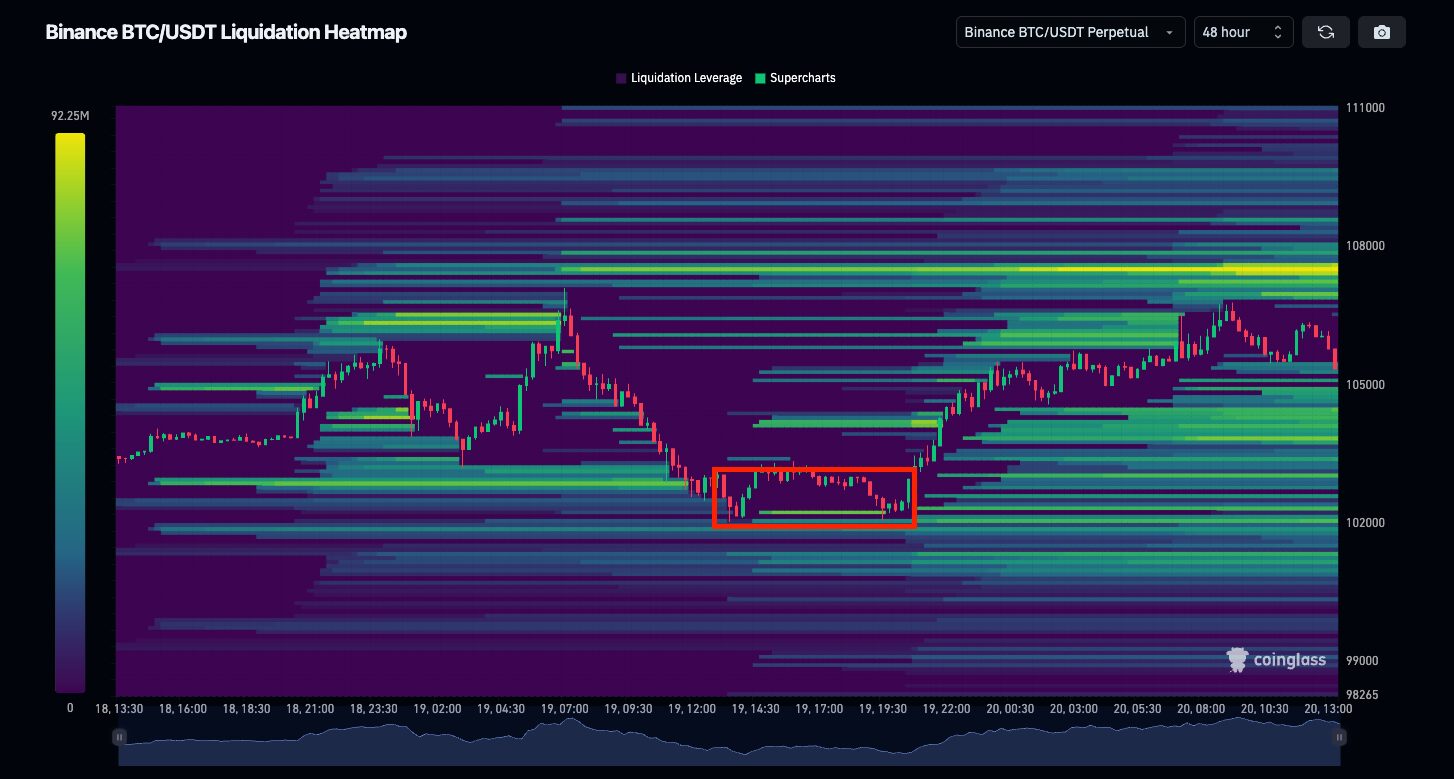
Trap Zone – Source: CoinGlass
Additionally, combining the Liquidation Heat Map with funding rate data enhances its effectiveness. A high positive funding rate alongside upper liquidation clusters is often a precursor to a short squeeze. Conversely, a negative funding rate with large clusters below may signal a short trap, followed by a sharp reversal upward.
Conclusion
The Liquidation Heat Map is becoming an essential tool for professional traders navigating the increasingly competitive derivatives market. Reading the heat map correctly not only helps avoid sudden liquidation sweeps but also allows you to capitalize on them by timing your entries more effectively.
That said, like any tool, it is not a silver bullet. Real trading advantage comes from smartly combining the Liquidation Heat Map with other market data and indicators. Above all, maintain discipline and adhere to solid risk management practices.
Read more: What is Market Cap in Crypto & Why It Matters for Investors?